Stocks are at historic extremes. Here’s what the data says — and why gold may be the more important story.
Most people still treat stocks as the default smart investment. The S&P 500 has delivered strong returns for decades, so the logic feels airtight. But a growing set of long-term indicators is pointing in a different direction. And when you look closely, gold has already been outperforming — quietly, and for longer than most investors realize.
Here’s what the numbers are actually telling us.
US Households Have Never Been More Exposed to Stocks
According to Federal Reserve data, US households currently allocate roughly 49–52% of their total financial assets to equities. That is the highest level ever recorded — higher than the dot-com peak in 2000, higher than 2007, and higher than any point in the last 65 years.
Goldman Sachs confirmed in mid-2025 that the 49% reading had slightly surpassed the previous peak recorded in 2000. Meanwhile, cash and debt holdings sit near historic lows.
This is not simply a portfolio preference. It means the entire American household balance sheet is effectively levered to the stock market. So when a correction hits, the damage doesn’t stop at brokerage accounts. It flows directly into consumer confidence, spending, and the broader economy.
The feedback loop runs both ways. And right now, more household wealth is tied to equity prices than at any moment in modern history.
Your Gold Buying Guide Most investors overpay when they buy gold. Then overpay again when they sell. This guide shows you exactly what to own — and why.
The Buffett Indicator Is at a Record High
To understand just how stretched stock valuations have become, look at the Buffett Indicator — the ratio of total US stock market value to GDP. Warren Buffett called it “probably the best single measure of where valuations stand at any given moment” in a 2001 Fortune magazine interview.
As of late 2025 and into early 2026, multiple sources place the reading between 217% and 232%, depending on the methodology used. Current Market Valuation puts it at approximately 230% — about 2.4 standard deviations above the historical average. Advisor Perspectives, using Federal Reserve corporate equity data, reported 232.6% — the highest level on record.
Here is why it matters. In theory, as GDP grows, company valuations should grow proportionally. The ratio should stay relatively stable. But at 200%+, stock prices have dramatically outpaced underlying economic output. Even applying an upward-sloping trend line to account for globalization and structural changes, valuations remain at an all-time record high above that line.
The gap between what stocks are priced at and what the economy actually supports has never been wider.
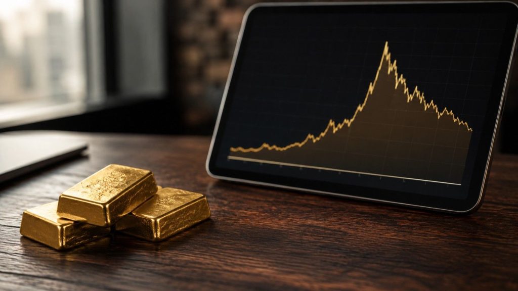
Gold Has Already Been Outperforming Stocks — Most People Just Don’t Know It
Here is something that rarely makes the mainstream conversation. Since the S&P 500 bottom in Q3 2002, the index — including dividends — is up roughly 1,150% in dollar terms. That sounds impressive. But when you price that same return in gold, it is actually down around 17%.
In other words, gold has outperformed the S&P 500, including dividends, over more than two decades.
The Dow-to-Gold ratio tells a similar story. In 2018, just before the COVID crash, the ratio sat at around 22. By late 2025, it had fallen to approximately 11, according to data from AdvisorAnalyst.com. That means gold outperformed the Dow by roughly a factor of two in roughly seven years. Go back to 2000, and the outperformance factor is closer to four.
More recently, gold gained approximately 60% in 2025, compared to the S&P 500’s roughly 16% rise. As DataTrek Research noted, gold was beating stocks by about 1.5 standard deviations above the long-term average — a level of outperformance typically seen only during major crises.
History shows that gold and stocks take turns leading. Each asset tends to outperform the other for extended periods — often a decade or more. By that measure, gold’s current cycle may have further to run.
What the Long-Term Ratio Points To
Looking at the Dow-to-Gold ratio going all the way back to 1900 reveals a clear, repeating pattern. Each asset class leads for an extended cycle. Then the pendulum swings back.
At prior cycle lows — most notably in 1980 — the Dow and the price of gold converged almost exactly. Both sat at around 873 on the same day. A ratio of 1-to-1.
We are nowhere near that today. Gold is currently trading around $4,800 per ounce (as of April 2026). With the Dow near 40,000, the ratio sits at roughly 8-to-1.
If history rhymes — even partially — the gap between these two could close significantly in the years ahead. That does not require gold to match the Dow point for point. It simply requires gold to keep gaining ground while stocks struggle to keep pace. Even a move to a 5-to-1 or 3-to-1 ratio would represent substantial outperformance for gold from here.
A Once-in-a-Century Market Signal
Perhaps the most striking piece of evidence in this analysis comes from a long-term momentum study comparing gold versus the S&P 500.
Using a 5-month True Strength Index — a doubly smoothed momentum oscillator that tracks trends and reversals — analysts have identified just four signals over the past 100 years where precious metals, commodities, and energy entered a confirmed bull era relative to stocks.
We recently got the fourth one.
Each of the previous three eras saw metals and commodities outperform stock markets by hundreds of percent. These are not short-term trades. They are decade-long cycles in which one asset class structurally leads the other.
The implication is straightforward. If you are still defaulting to a stock-heavy portfolio because equities have led for the last decade, the data suggests that assumption deserves a serious second look.
The Data Has Already Made Its Case
Stocks are crowded. Household exposure to equities is at an all-time high. The Buffett Indicator is at or near record levels. And gold has quietly outperformed the S&P 500 in real terms — including dividends — since 2002.
This is not a prediction. Markets are complex, and no single indicator is definitive. But taken together, these signals make a compelling case that gold deserves more weight in any serious portfolio conversation right now.
Want to see every chart and ratio behind this analysis? This shift may already be underway — watch the full video here.
Investing in Physical Metals Made Easy

People Also Ask
Is gold a better investment than stocks right now?
Based on long-term data, gold has outperformed the S&P 500 — including dividends — since 2002, when priced in real terms. With the Buffett Indicator near record highs and household equity exposure at an all-time peak, several indicators suggest the setup may favor gold over stocks in the years ahead. GoldSilver breaks down the full case in this video.
What is the Buffett Indicator saying about the stock market in 2026?
The Buffett Indicator — which measures total US stock market value relative to GDP — currently sits between 217% and 232%, depending on the methodology, placing it at or near an all-time record high. That level is roughly 2.4 standard deviations above the historical average, signaling that stocks may be significantly overvalued relative to the underlying economy. Watch GoldSilver’s full breakdown to see what this means for gold.
How much of American household wealth is in the stock market?
According to Federal Reserve data, US households currently allocate roughly 49–52% of their total financial assets to equities — the highest level ever recorded, surpassing even the dot-com peak in 2000. Goldman Sachs confirmed this reading in mid-2025, noting that household equity exposure had reached historic levels. When that much wealth is tied to stock prices, even a moderate correction can ripple through consumer spending and the broader economy.
How has gold performed compared to the stock market historically?
Since the S&P 500 bottom in Q3 2002, gold has outperformed the index — including dividends — by a significant margin when returns are measured in real terms. The Dow-to-Gold ratio has also fallen from around 22 in 2018 to approximately 8-to-1 today, reflecting gold’s sustained outperformance. In 2025 alone, gold gained roughly 60% compared to the S&P 500’s 16% rise.
What is the Dow-to-Gold ratio and why does it matter?
The Dow-to-Gold ratio measures how many ounces of gold it takes to buy the Dow Jones Industrial Average — and historically, it has cycled between extremes as each asset class takes turns leading for decades at a time. At prior cycle lows, such as 1980, the ratio fell to 1-to-1. Today it sits near 8-to-1, suggesting gold may have significant room to keep outperforming stocks before this cycle runs its course. GoldSilver covers this ratio in depth in the full video.
Disclaimer: This article is for informational purposes only and does not constitute investment advice. Past performance is not indicative of future results. Always consult a qualified financial advisor before making investment decisions.
You May Also Like:
Source link